Prairie Consulting: Recruiting Website of the Week!
In case you missed it, we’ve started featuring some of our favorite recruiting websites in a new series called the Best Recruiting Website of the Week.
So who did we crown the winner for the second week of this series? Drum roll please . . .
Congratulations to Prairie Consulting Services (www.prairieinc.com) for winning this week’s feature. Oh and shameless plug . . . we made their website earlier this year.
There’s a couple things in particular that make this site standout.
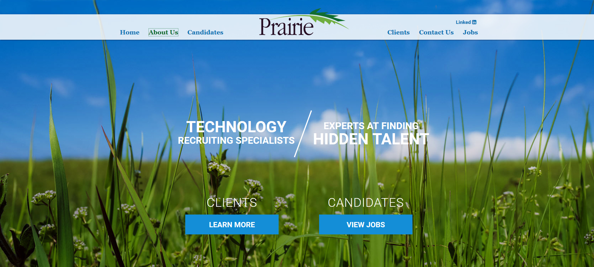
1. Homepage sets the pace. Everything you need to know and navigate on the page is above the fold. Candidates and clients clearly have their own section, both in the header and in the middle of the page. This helps with user experience for both of Prairie’s intended audiences.
2. About us page humanizes the brand. The about us page is a great addition to this site that helps the brand appeal to both clients and job seekers. This page helps put a face to the brand name and makes job seekers see who they are trusting with their job search. On the other side of things, this page shows clients their business advisor in their search. Also, this page doesn’t loose focus on how placements are the primary goal. Job seeker and client buttons are present on this page. Lastly this page looks just as good on mobile, with team bios visible from the start.
3. Navigation stays with you. Website visitors will have no problem finding the navigation on this site! The header stays with you regardless of what page you are visiting. Even as you scroll on the pages, the header stays within a viewable and clickable distance.
4. Easy to find Jobs and to Apply. This website is setup to do exactly what 99.9% of recruiters are most concerned about the most. With the jobs section of their website, job seekers can quickly search and apply for the job postings that peak their interest. Making this process easily accessible to job seekers means this website helps get as many applications as possible into the recruiting funnel.
5. Visually Appealing. The homepage is the perfect combination of Prairie’s brand colors. The blue and green are featured on all the pages, making this website cohesive and fun to look at.
Make sure to check out Prairie Consulting’s website on desktop and mobile, both of which are great examples of a recruiting website. Thinking about sprucing up your recruiting website? Make sure to check out our free website evaluation.