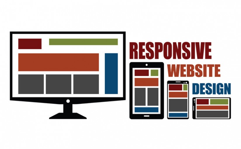
The 3 Key Points of a Recruiting Firm’s Website Design
A lot of personal preference is involved when it comes to the design of a recruiting firm’s website. However, there are certain points you should keep in mind when putting your site together. A website design is about more than just what the site looks like and feels like, and neglecting these other aspects can spell disaster.
Below are the three key points of a recruiting firm’s website design:
1. Navigation
There are two points to remember about navigation. First, the site has to be easy to navigate. People will not stay on a site that’s clunky or difficult to manage. The attention span for web visitors is miniscule. If it’s easy, they’ll do it; if it’s not, they won’t. Make navigating your website easy. You can do so by implementing a navigation bar, which is usually located just below the title on the front page. That navigation bar is then placed in roughly the same spot on all of the inside pages.
The second aspect of navigation to remember revolves around this question: “What is the number-one thing you want visitors to your website to do?” Is it contact you via telephone or email? Is it view your database of jobs or candidates? Is it register with your site and submit their contact information and/or resume? Whatever the case may be, the site’s navigation should guide your visitors in that direction. For example, if you want visitors to register with your site, make sure there’s not only a link on every page allowing them to do so, but a call to action, as well, such as “Make sure to register with us today!”
Website visitors don’t want to take the time guessing what it is you want them to do. They want to be told so they can make a decision. If you’re not straightforward and direct, they’ll be gone quickly.
2. Color
If, in the past, you’ve used certain colors in your firm’s logo, then you should use the same colors in your website. It’s vitally important that you utilize the same colors in a consistent fashion. This helps to market you more effectively. If you’re not exactly jazzed by the colors of your logo and the prospect of using the same color scheme for your website, then perhaps this is the time to change your logo or its colors. You could change just the colors of the logo or do a complete overhaul. Whatever the case, consistency is important. (Keep in mind that you can add colors here and there for effect or as a highlight to the main design.)
3. Style
What do you want to portray to clients and job seekers? High-tech? Old-fashioned? Or do you just want to keep is simple? What kind of graphics to include is an important decision when contemplating the style of your site, as are the different ways you want to incorporate the colors you’re using. Of course, as a recruiting firm, you’ll want to come across in a highly professional fashion, and this can be done in various ways, in accordance with individual tastes. In addition, you can incorporate other elements, such as moving text or pictures, which can be accomplished with special software. Making a site too flashy, though, can prove to be more detrimental than attractive. Above all, visitors crave simplicity and ease of use.
Something else to remember about website design is that a site can look outdated rather quickly. The general rule of thumb is to update the design of your site every 18 to 24 months. Wait any longer and you run the risk of falling behind the curve.
If you need a website built from scratch or if you believe that it’s time to update the design or functionality of your current site, check out some examples of websites that we’ve built for other recruiters.
For more information, you can contact me at 330.455.1433, x135 or at smiller@topechelon.com.